 Log in
 Sign up
The 7 Best Quality Control Charts
The 7 Best Quality Tools
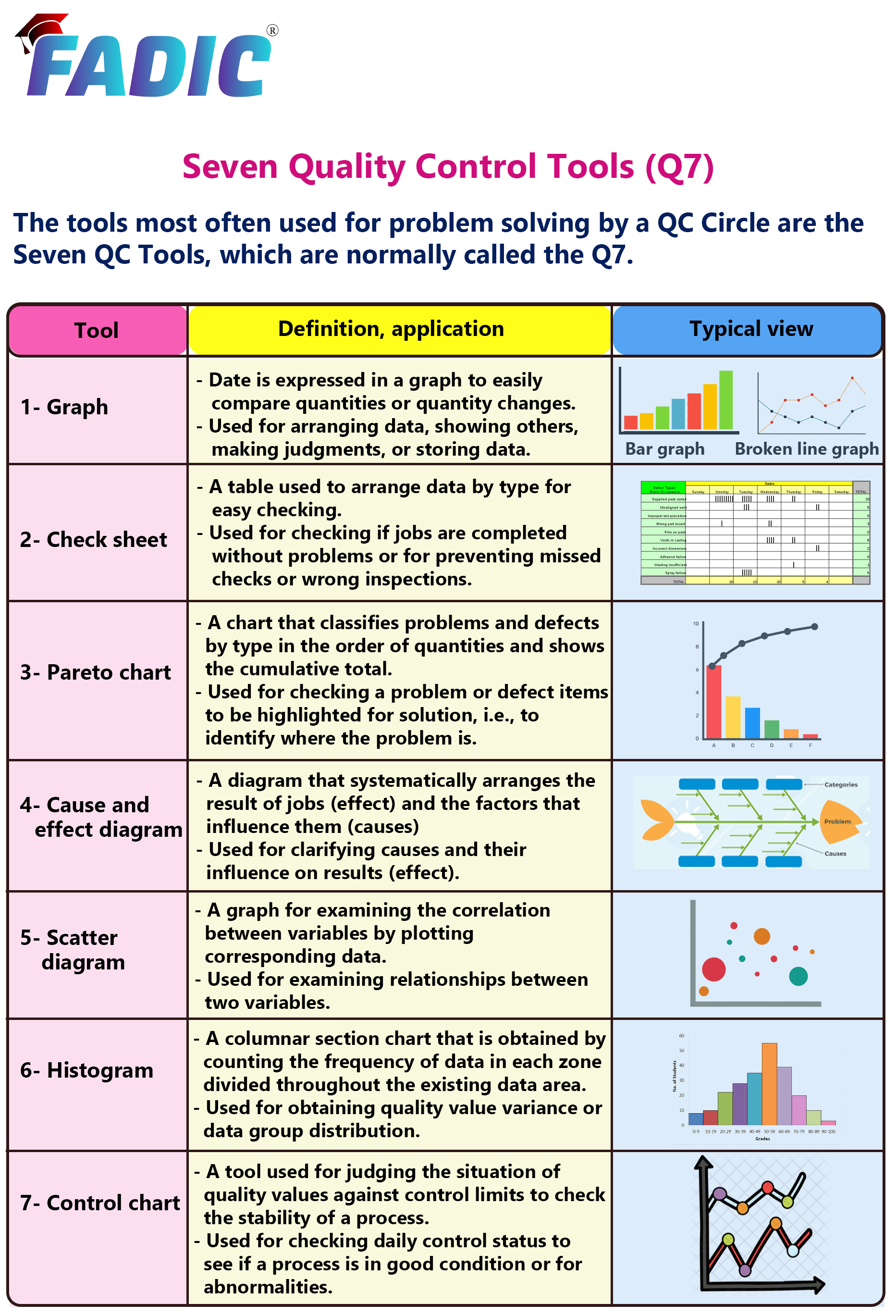
The 7 Quality Control (QC) Tools
- The Seven Quality Control (QC) Tools are simple statistical tools that assure quality management in all disciplines. They are used for assessing the entire production process by allocating the factors causing issues and solving them.
- These seven essential statistical quality control tools were developed in 1976 by a Japanese professor, Kaoru Ishikawa, to solve 90% of quality problems in any company.
- Moreover, these tools are more straightforward than advanced statistical methods.
- Many organisations use these tools to help monitor and manage their quality initiatives, assure high quality, reduce defects, and control costs.
- Hence, this set of tools is a gold standard for troubleshooting various quality-related issues and creating a better strategic quality management plan to satisfy the customer.
- In addition, the Seven QC Tools are used to represent data to give an organised picture of data and to make better decisions, so it helps as a decision-making tool.
Seven essential tools of quality include:
- Graph
- Check sheet
- Pareto chart
- Cause and effect diagram (Fishbone or Ishikawa diagram)
- Scatter diagram
- Histogram
- Control sheet
Graph

- Graphs are basic data representations with specified value units along the horizontal and vertical axes. Moreover, a bar graph can be used for comparing data that can be split into several groups or categories. While line graphs represent data change over time intervals.
- This tool may be mentioned in some resources as a stratification tool. Furthermore, this quality assurance tool sort data into separate and distinct groups. Separating data using stratification determines patterns and reveals the process of pinpointing problems and effectively achieving high-quality control.
Used for:
- Interpret new patterns from data gathered from a variety of sources.
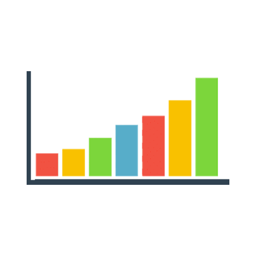
Check sheet
- A structured form that is used for collecting and analysing data; the data captured may be quantitative or qualitative.
- Furthermore, it is an easy and quick tool to compile and analyse data.
- A tally or check sheet represents data as a check or a tally mark.
- Each check mark shows the number of times the value occurs.
- Moreover, the checksheet lists data or information in a table to check each category or group of data. Thus, the simple setup and easy-to-read check sheets record frequency distribution data which helps in understanding the progress of the production process, following patterns and solving problems.
Used for:
- To quantify the types of problems or defects.
- To assess the defect’s location.
- To monitor or track the steps in the multistep process.
Pareto chart

- This tool represents data in bar and line graphs that show which factors are more significant.
- Moreover, the Pareto chart follows the Pareto principle (also known as the 80-20 rule), which Vilfredo Pareto made.
- Furthermore, the 80-20 rule states that 80% of the problem or failure is caused by 20% of the significant factors, and the other 20% of the problem is caused by minor factors, which amounts to 80%.
- It identifies the vital causes by arranging data by the frequency of occurrence in descending order.
Used for:
- Displays the relative importance of causes or factors of problems.
- Focus on or identify the reasons that impact solving the problem.
Cause and effect diagram
(Fishbone or Ishikawa diagram)

- A cause-and-effect diagram was developed by Kaoru Ishikawa, which resembles a fishbone.
- This tool identifies many possible causes or factors of the effect or problem and solves them accordingly.
- Moreover, this diagram helps sort ideas into categories and identify the root cause or factors of any problem, improving the work process by finding the solution.
- A fishbone diagram categorises causes or factors into six main groups: measurements, environment, materials, personnel, methods, and machines. These categories can help you identify the cause of the problem and find the solution.
Used for:
- Identify the possible root cause of any problem or the effect.
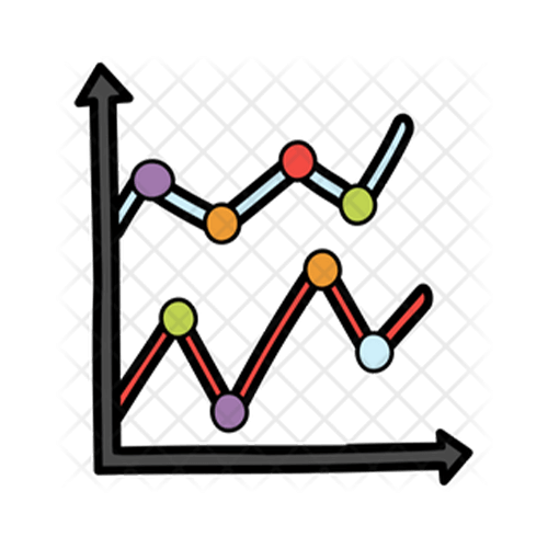
Scatter diagram

- A scatter diagram is a tool that shows the relationship between different data based on two sets of variables. This tool represents the correlation in a large amount of data.
- Moreover, a scatter diagram is used to investigate the relationship between different variables. If one variable is a good predictor of another, or if they tend to change independently.
- Additionally, a scatter diagram effectively facilitates deeper data investigations and finding a solution for the problem.
Used for:
- Discover and display the relationship between two sets of data.
- Establishing a relationship between the causes and the overall effect.
Histogram

- Histograms are used to show and understand data frequency distribution across distinct groups or samples.
- Moreover, it is used to show data distribution and the amount of variation within a process; thus, it helps to identify areas of improvement quickly and easily within your processes and pinpoints the possible defects, thereby, a better product quality.
- Furthermore, bars on the horizontal axis represent groups or samples. While the height of the bar represents variations/frequency of data within the group. Hence, the more the data cluster around the centre, the smaller the variation in the data will be. If the data are spread out from the centre, then the data exhibit more significant variation.
Used for:
- Measure the extent of variation.
- Assess the scope of improvements.
- Determine whether the process is in control and identify the best action to bring the process under control and reduce variations.
Control sheet
- This tool is a type of graph that shows how to interpret the change in data over time.
- Moreover, the control chart determines a quality characteristic’s average or mean value. It monitors performance over time by detecting the variation in data points. Furthermore, it compares current data to historical control limits to investigate whether the process variation is under control or out of control due to being affected by a particular cause of variation.
- Lines are known as upper and lower control limits, thus signifying the threshold at which the output is either controlled or affected.
Used for:
- Used to plot data points over time.
Importance of the seven QC tools:
- Easy to understand and apply by quality management professionals.
- Help understand and control the process.
- Flexible statistical tools that provide reliable decisions by visualising all process data.
- Used for different types of data in myriad situations and industries.
- Elucidate the process’s whole story, detect defects, and find solutions for problems.
In conclusion:
Seven QC tools help visualise large amounts of data for problem-solving and better decisions. It gives an organised picture of data for the quality management of any process.
Read More:
- 10 Skills You Must Learn to Do Research via Google Scholar
- Register Now at FADIC Clinical Research School
- Buy FADIC Toolkit for Writing Research to Write a Great Research Paper
- Read 10 Skills You Must Learn to Do Research via Google Scholar in Arabic
- The FADIC Online Continuous Medical Improvement Programs & Mini-Courses.
- Check Now the FADIC Book store and Buy books in different specialities.
- FADIC Podcast focuses on varieties of pharmacist perspectives in different specialities.
- Check Now about Coronavirus Resource Information Center.