 Log in
 Sign up
Graphs and Charts Commonly Use in Research
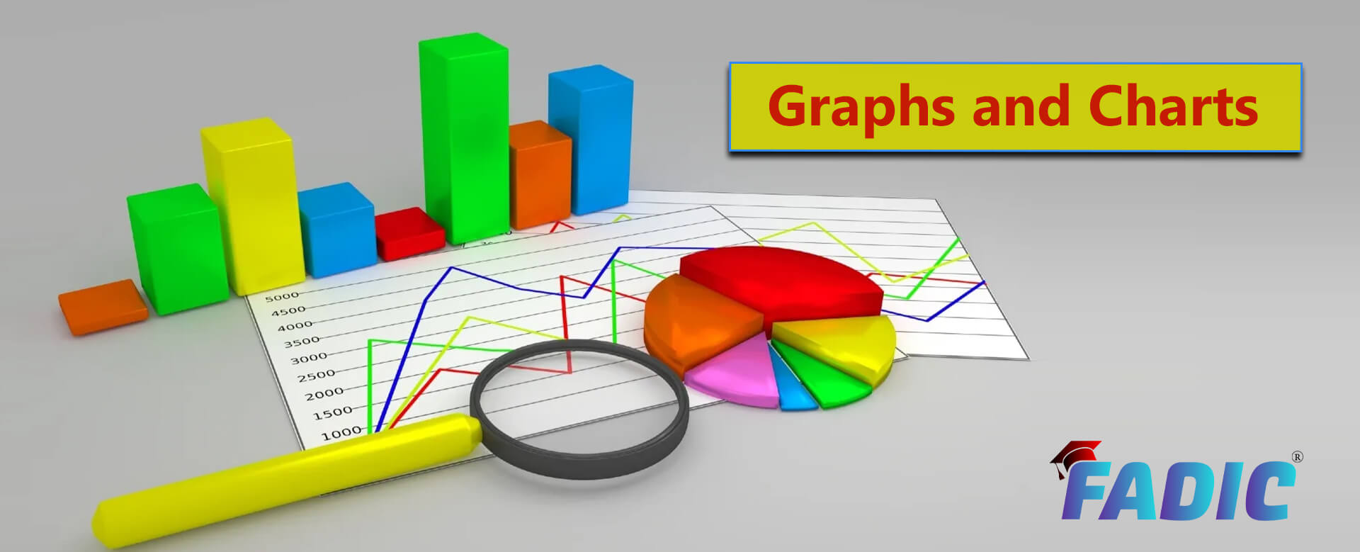
Graphs and Charts Commonly Use in Research
The commonly used graphs and charts include:
- Scatterplot
- Column chart
- Bar chart
- Line chart
- Combination chart
- Pie chart
- Stacked column
- Stacked area
- Histogram
- Venn Diagram
Graphs and Charts
- There are different ways to represent your data.
- What are the types of charts and graphs to present data? How to choose the right charts to describe your data?
- Together, we will figure out the graphing categorical variables, and you will be able to choose the best charts and graphs for presenting your data.
What is the difference between Graph and Chart?
- Charts is a synonym for Graph; a graph refers to a chart that explicitly plots data along two dimensions representing two variables consisting of curves or straight lines.
- Charts used to show comparisons between two or more sets of data. While a graph is used to establish the connection between related data.
- Choosing between a graph or chart depend on the data you want to display. Furthermore, all graph types are considered charts, but the charts are not considered graphs.
- Charts and graphs show comparisons between two or more sets of data. So, it should be straightforward to read and understand.
- Also, too much information should not be shown on the chart or the graph; otherwise, it might become confusing.
- In addition, charts and graphs used to present data should be accurate and precise and give an organised picture of the data.
- Moreover, it helps them make better decisions and communicate their results to others.
What are the common types of graphs and charts?
- Charts and graphs are critical to scientists, engineers, and financial analysts who use them to help visualise large amounts of information. It’s like using a picture that tells a thousand words.
- In addition, the way to present data differs according to the data type, so choose what suits the data.
The commonly used graphs and charts include:
Scatterplot
- To present many distinct data points on a single chart, it’s better to use a scatterplot chart.
- Moreover, a scatter plot is a tool that shows the relationship between different data based on two sets of variables. So, scatter plots are best used to represent the correlation in a large amount of data.
- Scatter plots are used to investigate the relationship between different variables. If one variable is a good predictor of another, or if they tend to change independently, it is easily presented by a scatterplot chart.
- In addition, scatter plots allow you to facilitate deeper investigations of your data effectively. It is usually used for analytics like cluster analysis or trend lines.
Tips to effectively present data using a scatterplot chart:
- Always start the Y-axis value at zero for better visualisation of values.
- Use custom mark types. Custom marks add a quick visual cue to your chart, clearly distinguishing different groups.
- To draw a correlation between variables, use trend lines.
- Moreover, it’s better to avoid comparing more than two trend lines, as too many lines make data difficult to interpret.
Column chart
- Presenting data using a column chart is suitable for showing data variables through time.
- Column chart categories are organised along the horizontal axis, and values along the vertical axis. Moreover, Column charts can be used for time series analysis and often display nominal variables.
- Furthermore, the Column chart is distinct from the bar chart. Where the column chart is opposite the bar chart. The Bar chart plots the variable horizontally and the fixed dimension vertically.
- Column chart includes simple, clustered, grouped, and stacked columns.
- Simple column chart is a chart used to compare values of more than one data set.
- Clustered or grouped column chart is better used for comparing values between different categories having several sub-categories.
- Stacked columns chart, this type of column chart is used to present data part to a whole comparison; instead of grouping column side by side, they are stacked in one column.
Tips to effectively present data using a Column chart:
- Always start the Y-axis value at zero for better visualisation of values.
- Choose consistent colours for the Column chart.
- Let the column width be more comprehensive than the gap between columns.
Bar chart
- Bar charts, a type of chart that is most used for data visualisations.
- It can quickly and simply show the difference in data over time or compare between different categories.
- Bar charts can run horizontally or vertically. Vertically bar charts are best used for data with long category labels.
- Moreover, bar charts are best used to compare data that can be split into several groups or categories.
-
In addition, bar charts can be simple or multiple or stacked.
- Simple Bar Chart: This chart can have vertical or horizontal bars of equal width. While the lengths of the bars vary according to the size of data values. For example, comparing Mercury levels in different water samples.
- Multiple Bar Charts: This chart consists of multiple bars or sets. This type of chart facilities the comparison between inter-related data. For example, comparing bad and good cholesterol levels with different treatments.
- Staked Bar or Sub-divided Bar Charts: This chart represents two data sets in one bar. Each bar is subdivided into two or more parts with different colours or shades.
- Tips to effectively present data using a bar chart:
- Always start the Y-axis value at zero for better visualisation of values.
- Horizontal bars are better used to represent data.
- Space between bars should be costumed to ½ bar width.
- Don’t use one colour for the bar chart; choose consistent colours.
- Order data correctly into categories or by values.
Line chart
- Line charts are only used to show data changing over time intervals.
- Moreover, It differs from bar and column charts in that it connects several distinct data points, presenting them as continuous evolution to visualise changes.
- In addition, line charts show time-series relationships with continuous data. It can be used to display data acceleration and deceleration.
Tips to effectively present data using a Line chart:
- It’s better to label lines immediately, to help readers to identify lines and corresponding labels quickly.
- Avoid plotting more than four lines. It will be crowded and inconvenient for readers.
- Always use solid lines, as dashed and dotted lines will be distracting.
- Shade the area under line charts to improve the readability of the graph.
- If your graph includes multiple lines, use different colours for better viewing each line’s relative contribution to the whole.
Combination chart
- A type of chart that is used to display different data types in various ways on the same chart.
- Simply, it plots multiple sets of data on a single chart. For example, it can represent the sales for each month in a year.
- It displays data in lines and columns in combination or the same chart.
- In addition, combination charts can easily highlight the differences between different data sets. It may display line to line, the line to the column, or column to column.
Tips to effectively present data using a Combination chart:
- Use different colours for visualisations of different correlated data.
- Use combination charts to show relationships between data sets.
- Moreover, make it simple for better readability of data.
- Arrange the data sets correctly so that all information is visible.
Pie chart
- The pie chart is one of the most common chart types. It presents data in a part-to-whole comparison with discrete or continuous data.
- This chart is impactful with a small data set. Also, named circle graphs, or pie charts
- Moreover, they express data as an approximate percentage of the whole proportion.
- It looks like a circle divided into sectors or pie-shaped pieces. The individual portions or pieces are differently shaded or coloured.
Tips to effectively present data using a Pie chart:
- Don’t use a pie chart for more than five categories per chart to avoid hiding important information. Small values are not substantial for comparing data.
- Also, ensure that data fits all pieces, as it may be tough to compare crowded essays.
- Verify that the total data value of all pie pieces is 100% and proportionate to their corresponding value.
Stacked column
- Stacked column is a bar chart that displays multiple data representations of various categories stacked over each other.
- Interestingly, this type of chart compares multiple sets of data-to-certain relationships. For example, you can use it to reach the effect of four different types of antibiotics on the growth of two types of microorganisms. Each bar represents the effect of an antibiotic on the development of both organisms.
Types of stacked column charts:
- Stacked Column
- 3-D Stacked Column Chart
- 100% Stacked Column
- 3-D 100% Stacked Column
- Each bar is subdivided by different colours based on a subgroup.
Stacked area
- Stacked area charts display a time-series relationship, but they are different from line charts because they can represent volume.
- Also, stacked area charts compare a quantitative progression over time.
- A stacked area chart is often used to visualise part-to-whole relationships to present each category contributes to the cumulative total.
- Furthermore, 100% stacked area charts are used to show the distribution of categories as part of a whole, where the cumulative total is unimportant.
Tips to effectively present data using Stacked area charts:
- For the readability of stacked area charts, arrange data by adding categories with highly variable data on the top and low variability on the bottom.
- Always start the Y-axis value at zero for better visualisation of values.
- Furthermore, avoid using transparent colours, which may affect data visualisation and hide important information.
- Don’t use more than four categories per chart to avoid hiding important information.
- In addition, stacked area charts should not be used to display discrete data.
Histogram
- Histograms graph used to show and understand data distribution across distinct groups.
- Histograms graph, groups data into specific bins or rectangles or bars. It allows you to identify the bins where most data falls. There is no space between the bars as intervals are continuous.
- For example, it is used to show student performance on an exam or the distribution of a disease.
- Moreover, a histogram provides a visual indication of the approximate centre of the data. It helps in understanding the degree of spread or variation in the data.
- Thus, the more the data cluster around the centre, the smaller the variation in the data will be. If the data are spread out from the centre, then the data exhibit more significant variation.
Tips to effectively present data using a Histogram graph:
- A histogram graph must be plotted with a zero-valued baseline.
- Make sure you choose the correct number of bins to express data distribution correctly.
Venn Diagram
- Venn diagrams consist of two circles that overlap in the middle. Where each circle represents one item that is being compared with the others.
- Moreover, the area where the circles intersect displays data in common.
- Venn diagrams are also used to compare more than two sets of data and identify correlations and predict probabilities when comparing data sets.
- Furthermore, Venn diagrams illustrate a logical relationship between two or more data sets. It graphically organises data and highlights similar and different aspects.
- Venn diagrams are often used for data illustrations in business and academic fields to organise complex relationships visually.
- Venn diagrams correlate with two variables. It is used to identify common factors or differences between distinct groups.
- Thus, Venn diagrams are considered a thinking tool for brainstorming and figuring out different relationships between different sets.
Tips to effectively present data using Venn diagrams:
- Make sure that you label all data sets in Venn diagrams.
- Avoid displaying more than three groups in a Venn diagram.
- In conclusion, data can be visualised in different charts and graphs, each of which can provide a specific insight.
- Firstly, it’s essential to identify and understand the story behind the data.
- Secondly, allocate the data relationship needed to be expressed by charts or graphs.
- Thus, identifying this information will help you to select the correct visualisation to deliver your message.
- Let your data become your organisation’s centrepiece by using it to fuel further exploration. So, understand your data and pick up one of the discussed ten charts.

Read More:
- 10 Skills You Must Learn to Do Research via Google Scholar
- Register Now at FADIC Clinical Research School
- Buy FADIC Toolkit for Writing Research to Write a Great Research Paper
- Read 10 Skills You Must Learn to Do Research via Google Scholar in Arabic
- The FADIC Online Continuous Medical Improvement Programs & Mini-Courses.
- Check Now the FADIC Book store and Buy books in different specialities.
- Watch Now FADIC TV to Keep Yourself Updated.
- FADIC Podcast focuses on varieties of pharmacist perspectives in different specialities.
- Subscribe Now to FADIC 2020 Daily News (FNN) and Keep Updated.
- Check Now about Coronavirus Resource Information Center.